Sketching a perfect design is only half the battle. The real magic that transforms a rug from an "amateur DIY attempt" into a "professional design piece" is the correct choice of colors.
So, how do you choose the right combination from hundreds of yarn cones? Here is the GG Tufting guide to color theory, specifically tailored for rug designers.
1. Light and Texture Effects on Yarn
Yarn doesn't behave like paint or crayons. Cut ends absorb light, while loops reflect it.
Absorbs light. Colors appear one shade darker and more matte than they do on the spool.
Reflects light. Colors appear brighter and more vibrant.
2. Guaranteed Color Formulas
Monochromatic
Shades of a single color. Best for modern and serene designs.
Complementary (Contrast)
Opposite colors. Best for high-energy, pop-art styles.
3. The Golden Ratio: 60-30-10 Rule
A classic interior design rule that prevents chaos in rug design. Don't use colors equally; use this ratio:
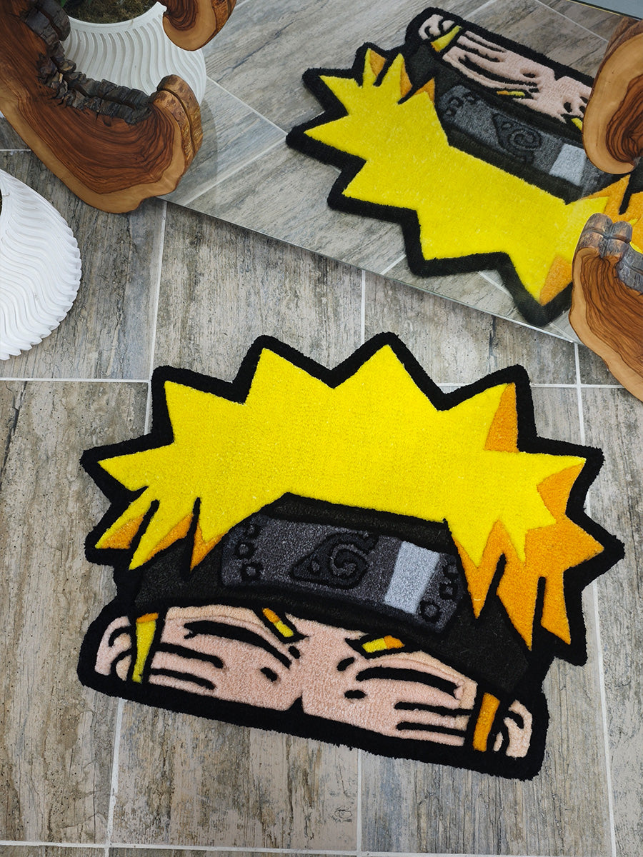
4. The Power of Outlining
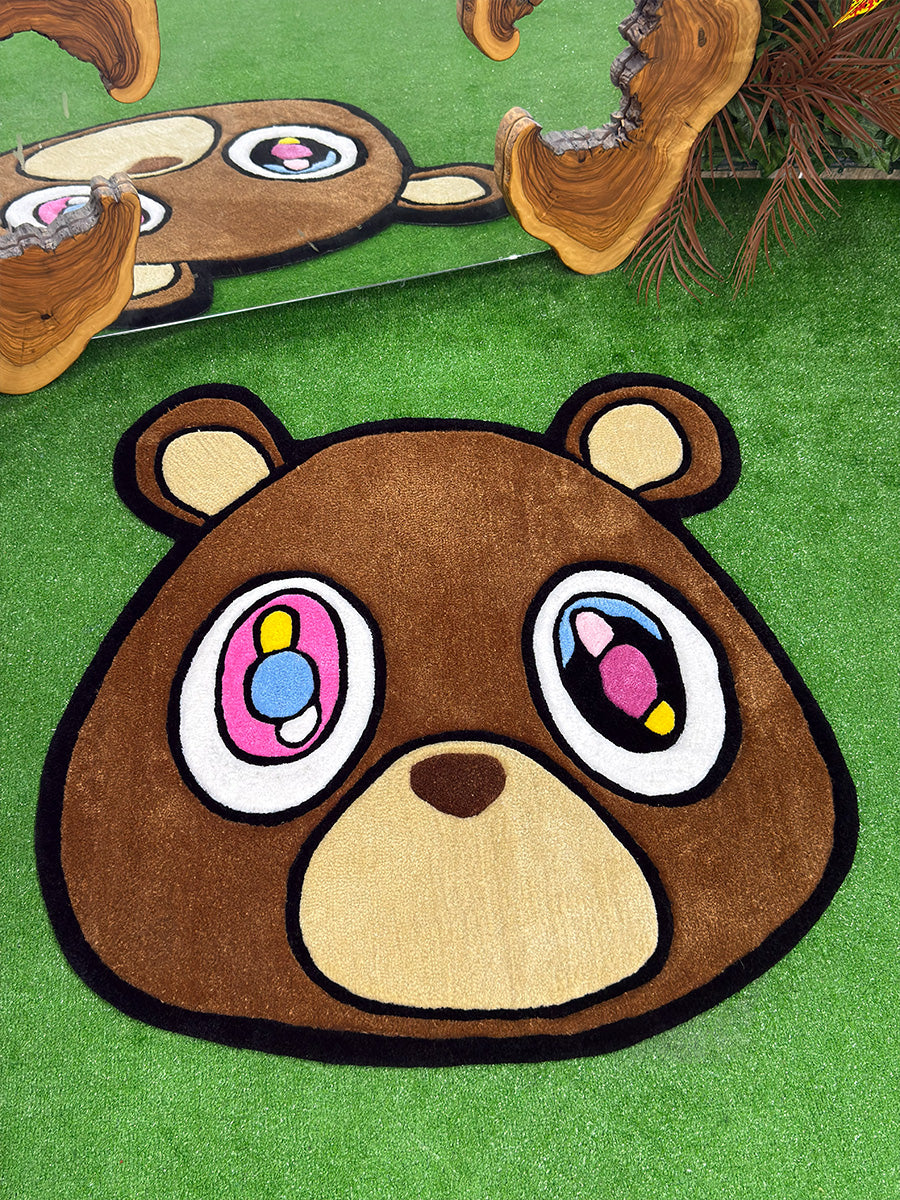
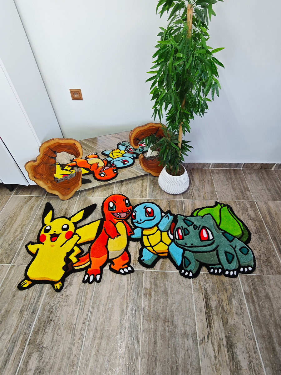
In tufting, colors have a tendency to merge visually (known as "bleeding"). A thin black (or very dark) outline between different color blocks separates them and sharpens the design. Think of it like the inking in a comic book.
Be Bold, But Plan Ahead
Before you pick up the tufting gun, line up your yarn cones side-by-side and snap a photo in natural daylight. If a color clash catches your eye now, it will be 10 times more obvious when the rug is finished.
Color theory rules aren't there to limit you; they exist to ground your creativity on a solid foundation.